Domain-Driven Data Visualization for Proportional Data
gghoneycomb is an open-source R package extending ggplot2 to create honeycomb-style hexagonal waffle charts for visualizing proportional data. The package was developed while working with environmental DNA (eDNA) data at Jonah Ventures, where I needed a visually compelling and clear way to communicate the relative abundance of plant species detected in honey samples.
The Problem
Pie charts are the traditional tool for representing part-to-whole relationships, but they are notoriously difficult to interpret accurately. Human perception struggles to compare angles and areas, making small differences between categories hard to distinguish.
In the context of pollen composition in honey, researchers needed a visualization that preserved the intuitive “part-to-whole” relationship while improving clarity and interpretability.
The Approach
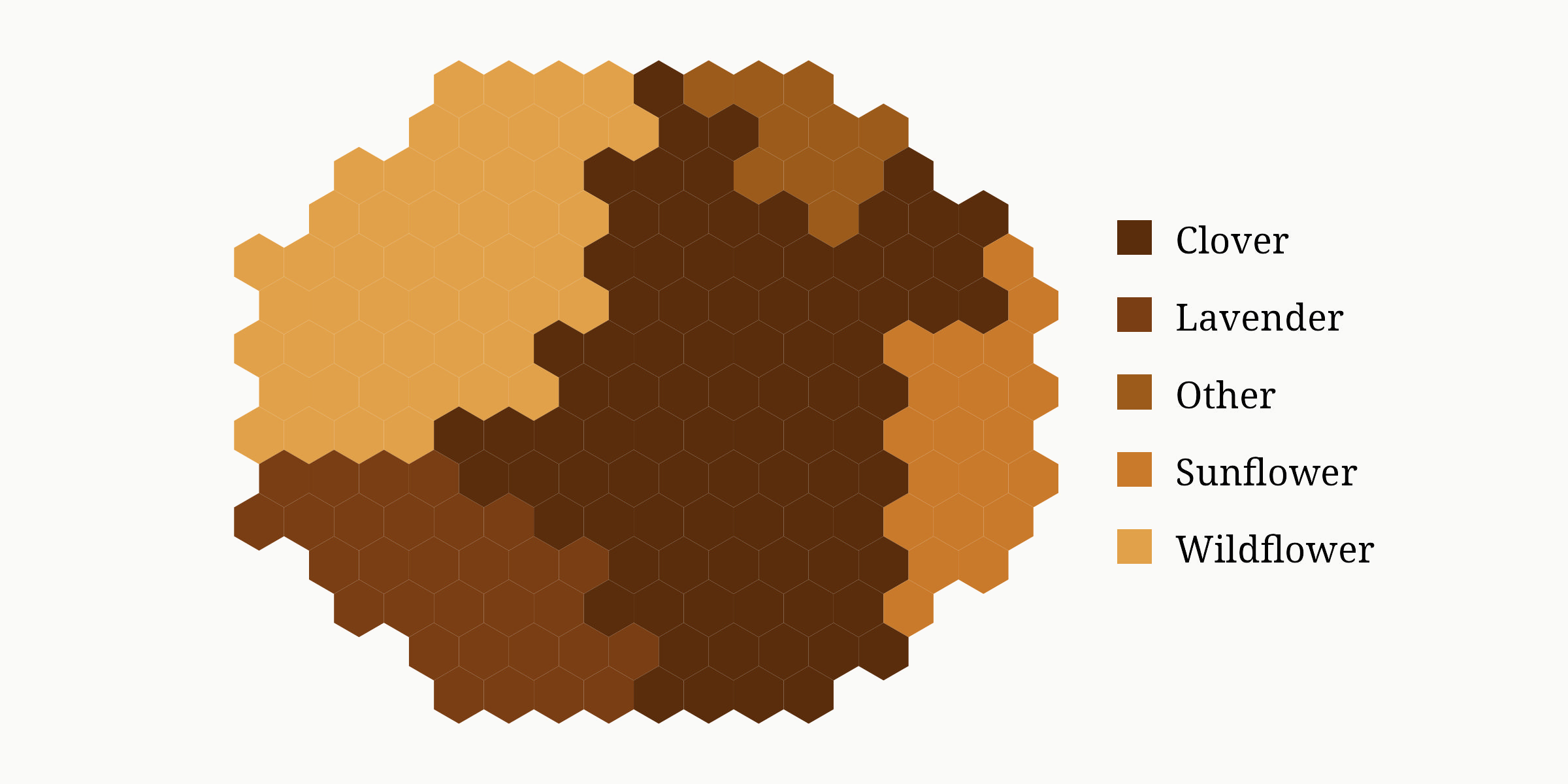
The design drew inspiration from the domain itself: bees do not make pies — they build honeycombs.
gghoneycomb represents each category as a contiguous region of hexagonal cells. The number of cells allocated to each category is proportional to its value, creating a visually intuitive representation that supports rapid comparison while maintaining structural coherence.
The visual metaphor reinforces the ecological context while remaining statistically rigorous.
Technical Implementation
The package combines proportional allocation with graph-based hex-grid layout algorithms:
- Proportional cell allocation using largest-remainder rounding
- Region-growing algorithms that ensure each category forms a single contiguous cluster
- Breadth-first search (BFS) for adjacency and connectivity guarantees
- Fallback carving strategies to ensure valid layouts when initial region growth fails
- Odd-q offset hex coordinates for adjacency computations and reproducibility through seed
The result is a layout algorithm that balances proportional accuracy, visual coherence, and algorithmic determinism.
Outcome
gghoneycomb provides ecologists and data scientists with a distinctive alternative to pie charts for proportional data visualization. By combining domain-aware design with rigorous graph algorithms, the package demonstrates how scientific context can inform both aesthetics and implementation.
The project highlights an approach that extends beyond visualization: building tools that respect both the data and the domain from which it originates.